

Recruiting volunteers is a common struggle for volunteer managers, and it’s such a crucial component of success. We know that a succinct volunteer recruitment plan, volunteer management plan, and social media strategy can all help you engage with volunteers. But the other thing that can have a huge impact on your success is your online presence. Specifically your website!
Your website is such an important part of your all-around volunteer management strategy – it’s something you own, you control and a place where you can really sell yourself.
And as more and more elements of our daily lives move online, it makes sense that your website is the first place potential volunteers look to find out more information about your organization, and hopefully sign up!
So to make sure your website is performing its job, we’ve put together a few tips to help you boost volunteer engagement on your website.
Our volunteer web design tips include:
- Make it look professional (and an easy way to do that)
- Simplifying your content
- Smart navigation
- Celebrating volunteers
- Make it accessible
- A clear call to action and a great registration form
So let’s dive into these tips and hopefully, you can use some of this advice to improve the effectiveness of your volunteer website.
1. Make it look professional
One of the easiest ways to personalize your website is by choosing a color scheme, But unfortunately, we see too often that color, pattern and font choices are simply too overwhelming. Instead of capturing the reader’s attention, they turn them away. While it’s important to make your website match your brand colors, that can be done in a more subtle way that makes your website look very professional and interests potential volunteers.
Consider these tips:
- Using a plain white background with black font in a simple style such as Arial, Verdana or Times New Roman.
- Avoid any colors that blur/contrast or are too neon as these are hard to read
- Stick to two or three colors in the design
- Use brand colors in the header or footer banner, or for headings
- Stick to just two fonts. Use a large font size for text and a small one for body text
- Replace lots of small photos with one larger photo, or a slider gallery
With so many people accessing the internet on their phones now – including 19% of 25-40 year olds (millennials) that are smartphone-only internet users according to a recent survey – making sure your site has a mobile-friendly design is of the utmost importance. You don’t want diminish volunteer engagement and lose potential volunteers because your website is clunky to use on a mobile.
The easiest way to do this is through responsive web design. The good news is that most web hosting software automatically does this for you. But when you’re designing, it’s always a good idea to check how your website looks on your computer and then also test the site on your phone and other mobile devices. If they look nice and are easy to navigate, without any text or images being cropped off, your site is responsive!
So, how do you do all of this without a degree in web design? Easy!
Recruit volunteer web designers!
Web designers are always willing to offer their expertise for a good cause. In return, they get to grow their portfolio, hone their skills, participate in unique design projects and reach a new audience that will potentially turn into paying clients.
So, post a volunteer job ad for volunteer website development, and turn your website into a professional-looking site that volunteers love!
2. Simplify your content
The content, which includes all the text and information you have on your website, should all have one goal: to encourage volunteers to sign up!
And while it might be tempting to add every single piece of information you can, sometimes that can actually be overwhelming. Big walls of text on web pages are hard to read and most people won’t actually read all the way through. So to make sure you’re not losing readers halfway down the page, it pays to simplify your content. Try using these formatting tips for volunteer web design:
- Use subheadings: Subheadings are a great way to break up walls of text and enable readers to skim through the information to find what they are looking for quickly.
- Use bullet points: They are also helpful tools to break up large chunks of text and make it more readable. Bullet points work great for things such as listing roles, responsibilities, tasks or qualifications.
- Keep sentences short: Aim for 20-25 words in sentences. Any longer, and they can be hard to read, and any shorter they can sound choppy.
- Left-justify text: Center justified text is much harder to read than left-justified.
- Use pages with a clear navigation menu to separate information.
The best way to test the content on your site is by getting a few people to run their eyes over it and give you feedback. These website volunteers could be volunteers, friends and family. Don’t forget to ask them to also test your website on their phones and computer. You could set up a short questionnaire, asking questions such as:
- Did you feel like there was too much or not enough information?
- Did you find it hard/easy to find information about registering to volunteer?
- Was there any key info missing?
- Did you find the site easy to navigate?
- Was there anything that you found hard to read or understand?
While some issues may be personal things, if there are any common complaints that come up multiple times, you can get to work fixing them.
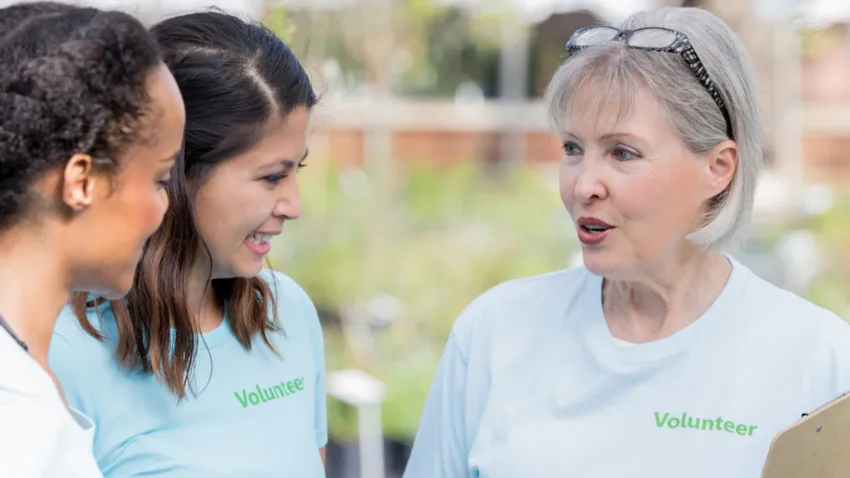
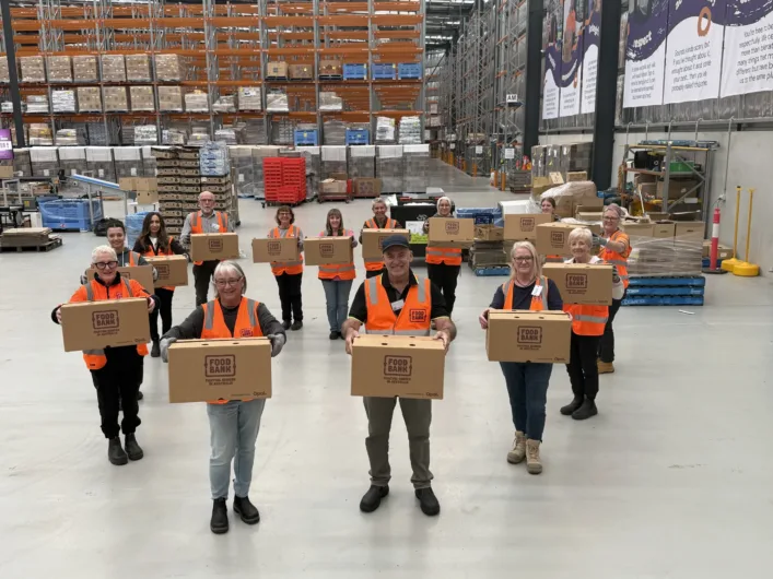
4. Celebrate your volunteers
Organizations involving volunteers are so reliant on volunteers to ensure the smooth running of their programs. And we know that volunteer recognition is a big factor in keeping volunteers engaged and motivated, so why not take the opportunity to celebrate and thank your volunteer on your website.
Not only will your current volunteers feel valued and appreciated (and who doesn’t like their 5 minutes of fame), it will also demonstrate to future volunteers that you truly appreciate your volunteers.
On your website, you could add a page called ‘Our Volunteers’.
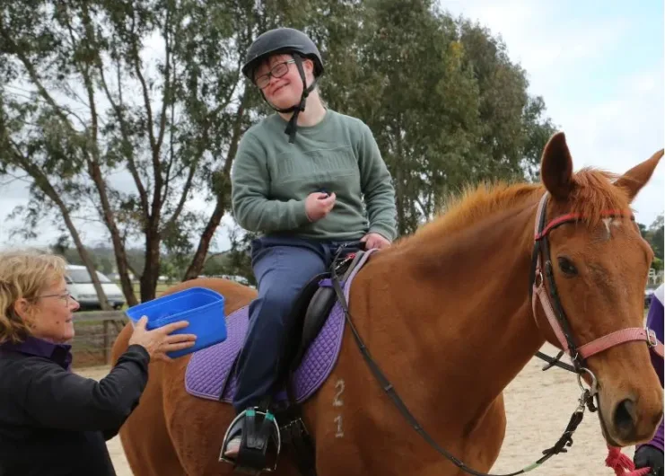
Here you could feature volunteer profiles, ‘volunteer of the month’ awards, achievement awards for some of your longest-serving volunteers and more. You could also highlight any achievements, statistics or successes you’ve been able to achieve through the support of volunteers.
You probably also have hundreds of great photos showing your volunteers in action, so why not make a gallery on your website that shows what sort of things volunteers do, and how much fun they have doing it!
Videos also perform well, so put together a short highlight reel of your volunteers, including some comments from volunteers about why they love volunteering with you.
You might also want to use this page to share some important volunteer resources, such as training resources, resources on promoting a healthy work-life balance, a calendar of events, or media links about the benefits of volunteering.
Remember, when volunteers feel appreciated, they are more likely to continue volunteering with and supporting your organization.
5. Make it accessible
Web accessibility means that websites, tools, and technologies are designed and developed so that people with disabilities can use them, writes W3.org. Disabilities may be auditory, cognitive, neurological, physical, speech or visual, or even something as simple as lost glasses or bright sunlight.
To ensure your website is accessible, you want everyone to perceive, understand, navigate, and interact with your site equally. This will ensure you can recruit diverse volunteers from all walks of life, without excluding anyone. Diversity promotes inclusion and understanding, often a major goal of non-profits and volunteer-involving organizations, while increasing the richness of ideas and respect for each other.
There are a few basic things you can do immediately to ensure your website is accessible:
- Add Page Titles to all pages: The first thing screen readers (used by vision impaired people) say when the user goes to a different web page is the page title.
- Add alt text: For every image on your website, ensure it has an ‘alt tag’ with appropriate alternative text describing the image.
- Add headings: Made sure all text that looks like a heading is marked up as a heading, eg. <H2 Introduction H2>
- Color contrast: Make it easier for people to read, by ensuring there is a high contrast between background and text (eg. black and white)
- Text size: Make sure if you increase the text size using the + button, all text increases evenly.
- Keyboard access and visual focus: Make sure the TAB key can move between elements on a page
- Form labels: If you have any forms, such as Contact form, make sure each form field is labeled, e.g.: EMAIL
- Avoid moving, flashing, or blinking content, or ensure there is a way to pause it.
- Add captions to videos
If you would like to learn more about making your website accessible, visit https://www.w3.org/WAI/test-evaluate
6. A clear call to action and a great registration form
If the aim of your volunteer website is to recruit volunteers, you should always be directing people to sign up using the registration form. Therefore, a SIGN UP NOW button should always be visible, and the top right-hand corner is a great place to put it.
Once they get to that page, your job is almost done! The last thing that needs to be done is get them to complete the necessary volunteer forms, so you want to make it as simple as possible.
If you use a volunteer management software such as Rosterfy, you will be able to create a custom volunteer registration form that you can add to your website, so that volunteers are automatically added to your volunteer system without any double handling.
So take the opportunity to customize the volunteer signup form to suit your needs. Excessively detailed, long, or complicated forms discourage completion, so keep it as concise as possible while capturing the essential information.
The essentials such as name and email should be marked as required fields (usually with a star next to them), and everything else can be optional.
These could include questions about availability, skills, qualifications and experience, unless of course any of them are essential to becoming a volunteer with you. Much of this information can be added afterwards in the volunteer portal once they’re onboard.
Make sure you include your organization’s logo and brand colors on the registration form to keep it looking professional. This also helps if people sign up directly from other channels such as Facebook.
Once someone submits the form, they are officially in your database. Now it’s time to put your Volunteer management software to work handling the automated onboarding. You can set up automations that include a welcome email, induction, invitation and scheduling of interviews or welcome sessions, contract signing, and shift selection and scheduling, all without you having to lift a finger (or phone).
Conclusion
Hopefully these six volunteer web design tips will help boost volunteer engagement and conversion on your website by highlighting volunteer opportunities and making the process to express interest in volunteering at your company so much easier.
Remember, if you don’t have the skills to update your website, think about recruiting volunteer web designers to help you. This would be a valuable resource as they will be happy to put their skills towards a good cause while growing their portfolio and network, and you get their expertise without breaking the budget.
About Rosterfy
Rosterfy is used by nonprofits, charities, sporting federations, local governments, and more to better manage their volunteer programs by improving how they can recruit, screen, train, and retain volunteers.
Our market leading technology helps you create an engaging experience throughout the whole lifecycle of your volunteer journey.
Explore additional blogs


REQUEST A DEMO
Unlock the potential of your volunteer program
Book a short discovery call with our team to learn how Rosterfy can help you better connect with, manage, and inspire your volunteers.